
Paradox (noun) – a statement or proposition that seems self-contradictory or absurd but in reality expresses a possible truth; a self-contradictory and false proposition; any person, thing, or situation exhibiting an apparent contradictory nature; an opinion or statement contrary to commonly accepted opinion.
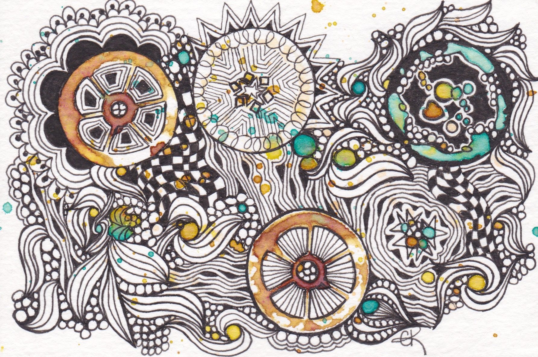
I think it was fitting this week that the Diva Challenge (#301) gave us a duotangle of Rick’s Paradox vs Diva Dance. It is almost like its a statement of what is going on these days. the contrary positions between what we know to be right and what is being presented to us has a lot of us at our wits end. Many of us are just plain sad a lot. But..spirits lift when tangling. I played in my black journal again this week. The paper makes white pen fill a little better (I think it is black charcoal paper…a little less absorbent than tiles.)

It also occurred to me that it looks like a slice of pizza. Appropriate for my Italian journal, eh?
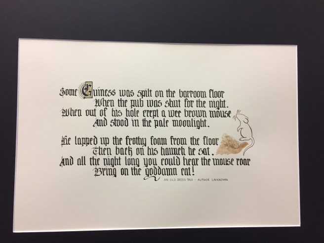
We wrapped up a 4 week Gothic Calligraphy project last Thursday evening, with a showing of what we worked on. I was pleased with my result, and find it frame worthy. Although I’m not sure where to hang it so as to not offend people. (I have a bit of a wry sense of humor….and I needed this to entertain me so that I would continue the 6-7 times I had to re-do it!)
Everyone did quite well, as you can see from our pieces!


If you are interested in more calligraphy, won’t you join us on Thursday to learn to paint Medieval Boxed Capitals? Class includes all materials! Call the shop (951-972-3015) and reserve your spot. (Leave a message if I am not there!)

Ciao! (Vacation planning underway…this year, Rome and Naples area.)

Gorgeous work! I love your white on black Diva piece, but I’m blown away by your amazing calligraphy! That is definitely frame worthy and the message is a hoot;-)
LikeLiked by 1 person
Lovely Diva tile! Great choice to do it in white on black.
LikeLiked by 1 person
Ha, Ha! It does look like pizza! LOVE IT! And your calligraphy is amazing! I’m self taught at calligraphy and don’t do enough to really perfect it. Thank you for showing us the beauty of it! I love your last photo… is there a name for that style??
LikeLiked by 1 person
That is a Medieval Boxed Capitol. You usually see it on the first page of a chapter.
LikeLike
A lovely tile and and amazing calligraphy work, the medieval boxed Capitale is sooooooo beautiful!!!
LikeLiked by 1 person
The calligraphy is fabulous – I love the poem, so much nicer than “inspirational” quotes. The Diva tile is great but when I saw the illuminated letter I was just blown away. Beautiful, stunning…
LikeLiked by 1 person
Lovely calligraphy, and the challenge on the black is super as well!
LikeLiked by 1 person
Like everybody else, I LOVE the calligraphy.
LikeLiked by 1 person
I love the last one.
LikeLiked by 1 person
Your tile is lovely as is your calligraphy! If I lived anywhere near you, I would take your class
LikeLiked by 1 person
Love your tile and agree with the timeliness of the somewhat hidden statement in the challenge. Strange times we live in, indeed! The calligraphy is beautiful. I’ve been trying to do a little (very little) calligraphy, but nothing like what you have done. I have to say that I totally love your calligraphy piece and I may have to try to letter this one (with your permission, of course) because it so fits in with my extended family! Beautiful work and I really wish I lived closer, it looks like a great time down at your place!
LikeLiked by 1 person
By all means, I found that cute poem online, see the credit line with Author Unknown. Please use it!
LikeLike
Great calligraphy Char! Love the white on black diva challenge too.
LikeLiked by 1 person
Your challenge tile is done very well, but like most of the others, I really like your calligraphy. I am not sure I have the patience to do that. The closest I come to that is using a stub nib fountain pen. I have trouble keeping that consistent, not sure what I would do with a dip pen.
LikeLiked by 1 person